Corey Nelson UX, Product & Conversation Designer
Specialist User Experience and Product Designer
Corey Nelson UX, Product & Conversation Designer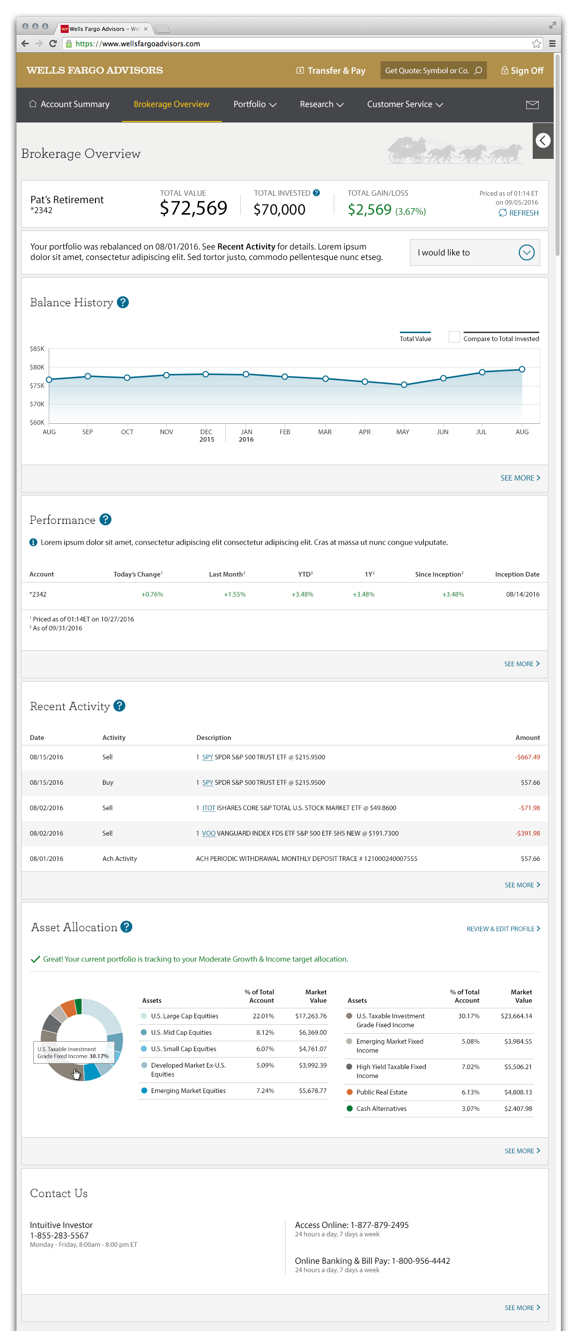
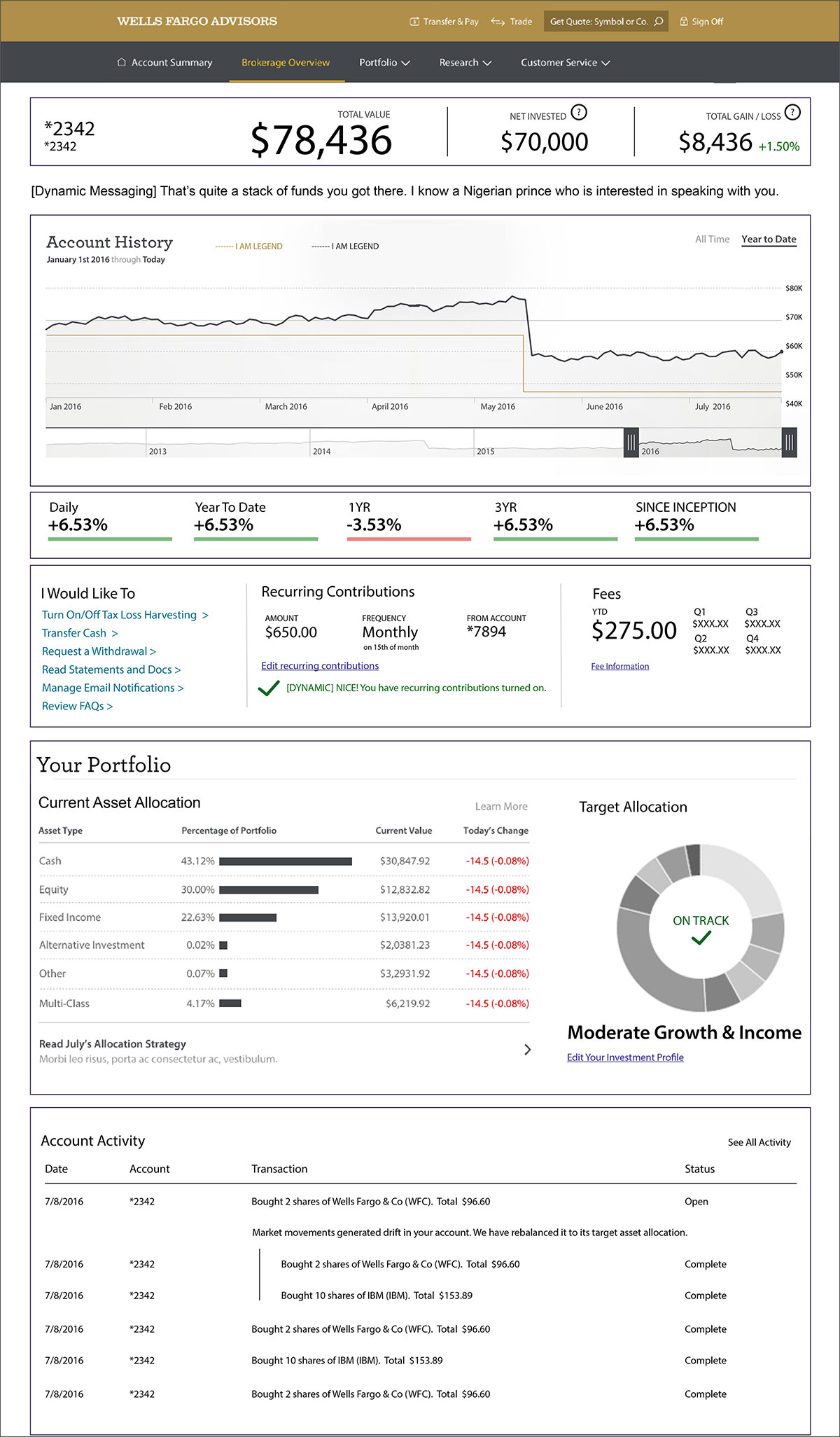
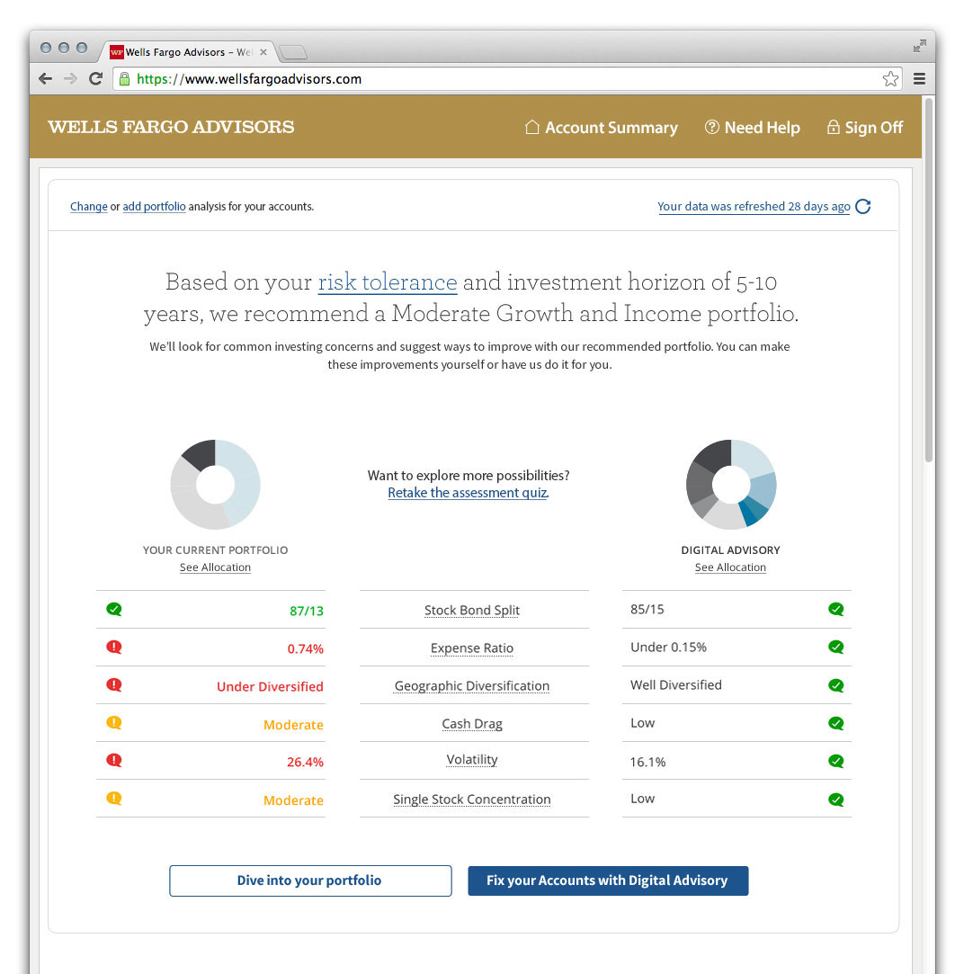
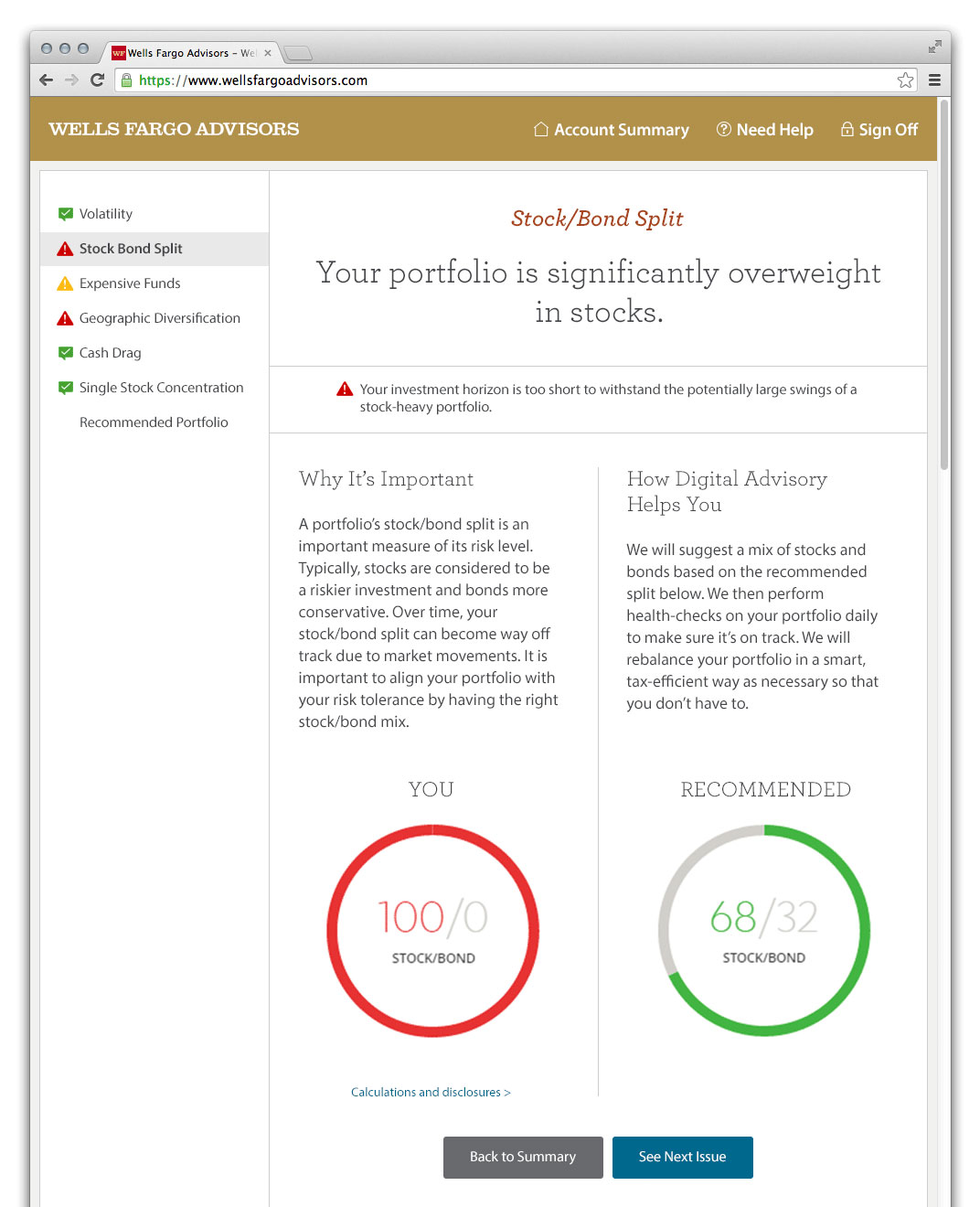
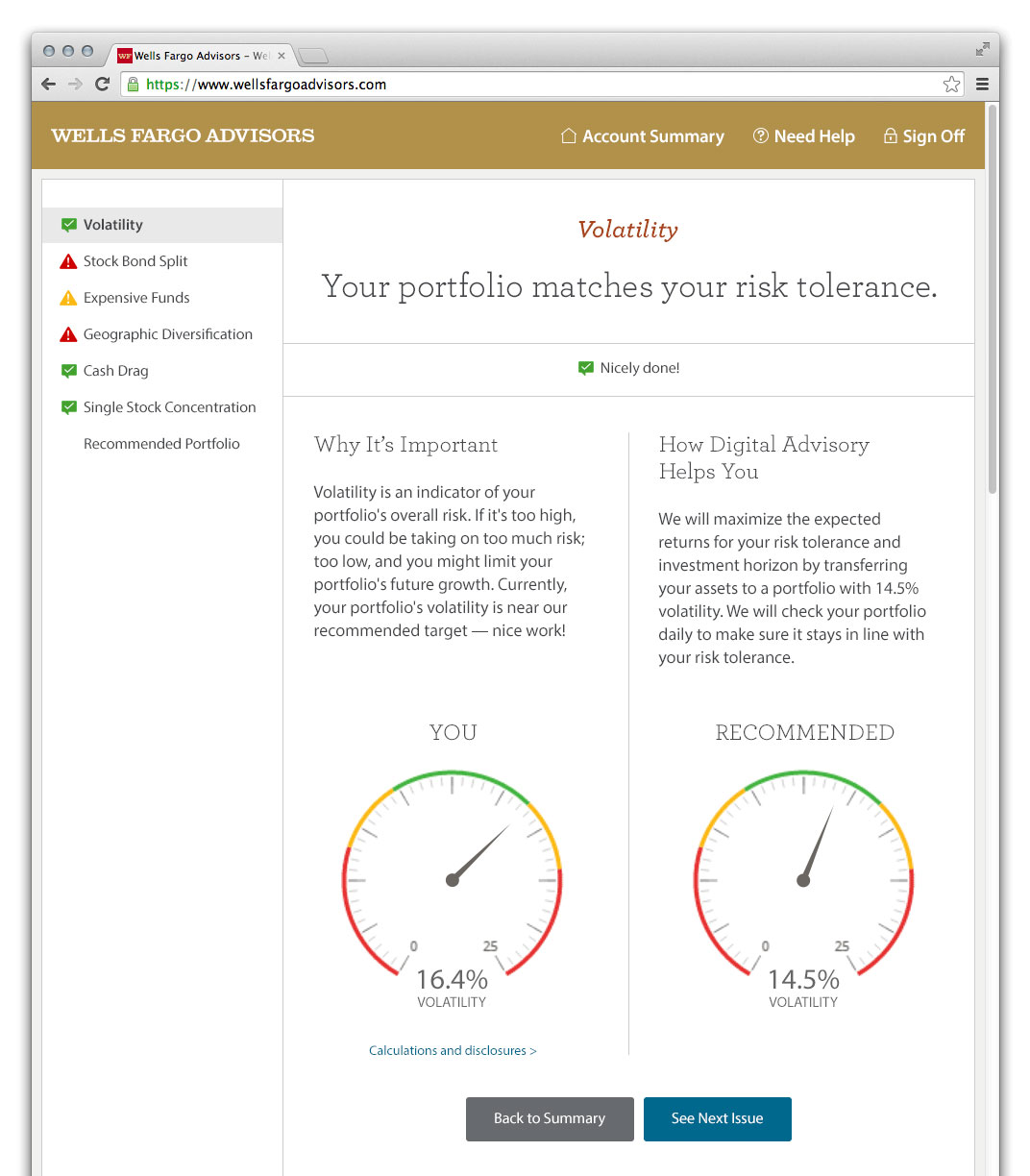
Account Dashboard
I worked on several areas of the overall experience, however the dashboard was the experience I led the design and spent most of my effort on.
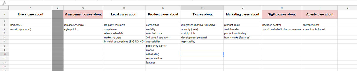
Stakeholder Priority Map
It wasn’t necessary to do a stakeholder “map” in the conventional sense. Stakeholders are identified long before projects are ready for design at Wells Fargo. However, I did clearly outline those stakeholders along with their priorities to leverage and defend later design decisions.
I wasn’t able to interview each group before beginning design work. This is why some functional areas have more points than others.
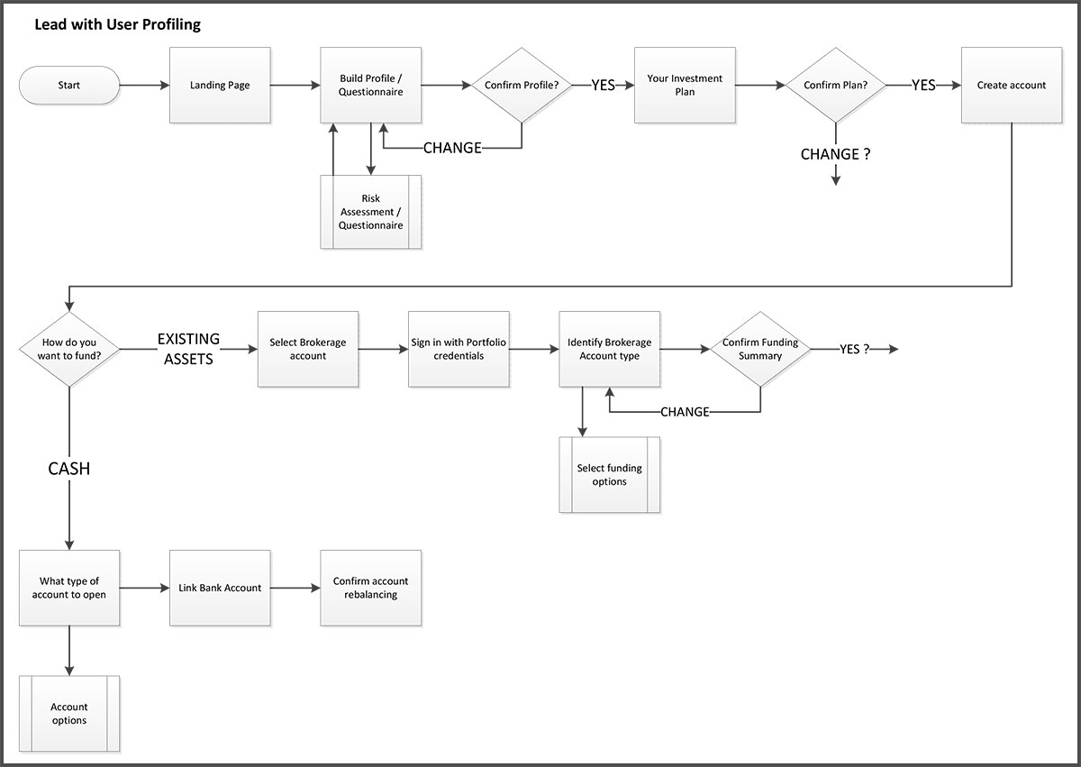
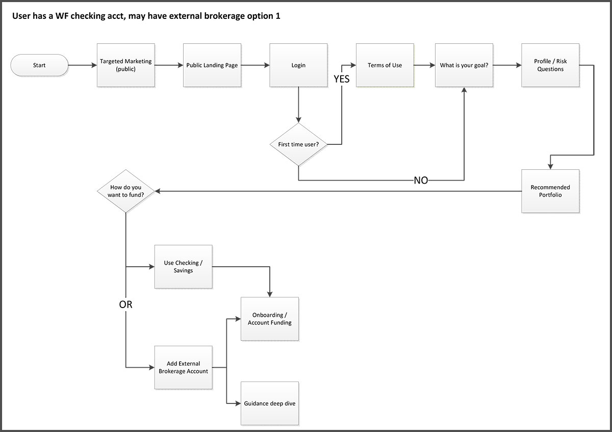
User flow diagrams
I made these more for me than anyone given the size and complexity of the project. I used these to check that all my interaction points were covered and we agreed on the customer journey.
…until the maps were made obsolete as they often are. Things get descoped.
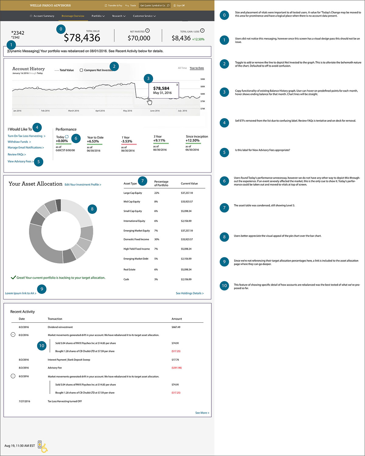
Wireframe iterations
I iterated on feedback and research from user testing. This is a concept I created, one of about 30 bajillion.
I’m only committed to the design that is best, so along with many rounds of user testing and feedback, I iterated…
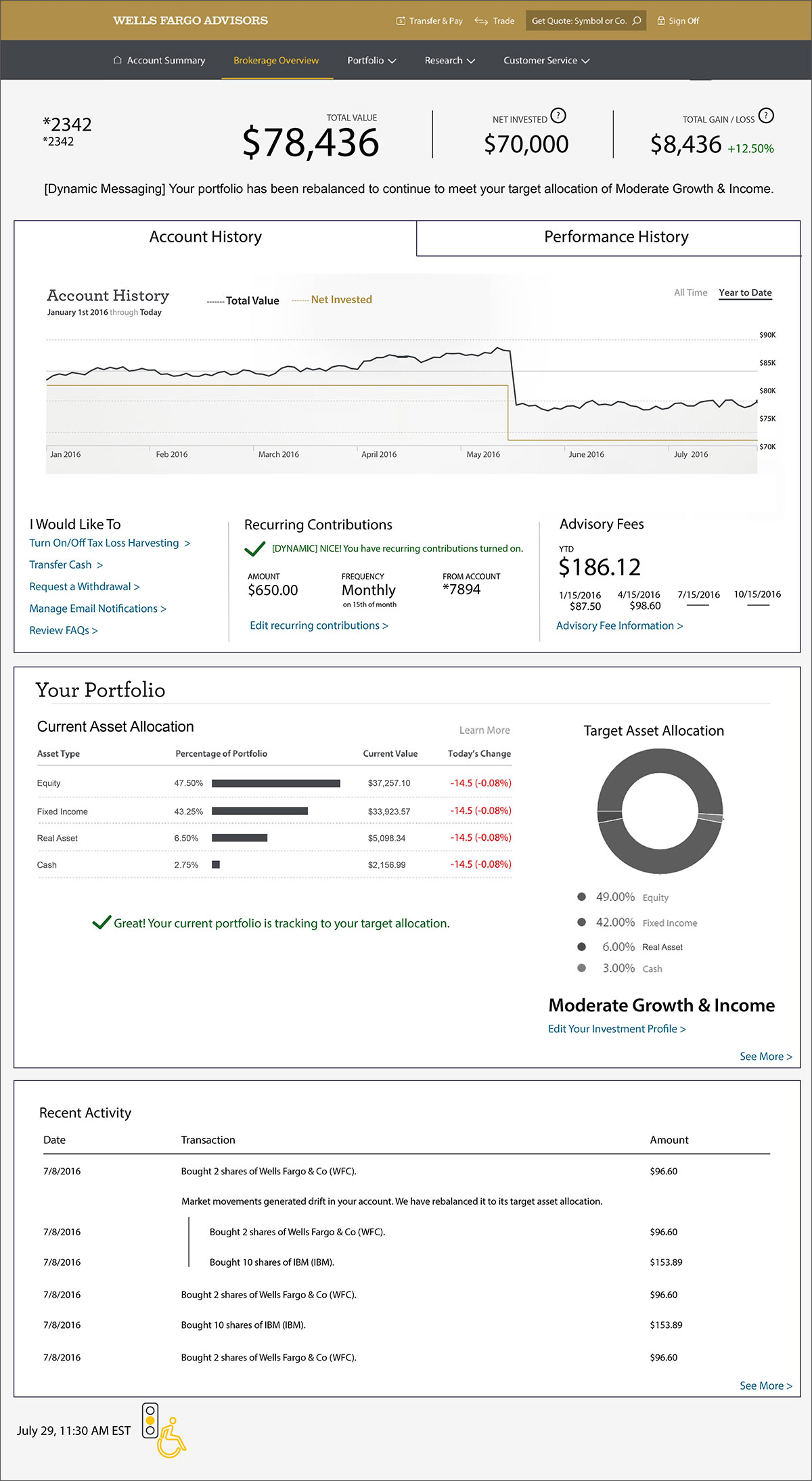
and iterated…
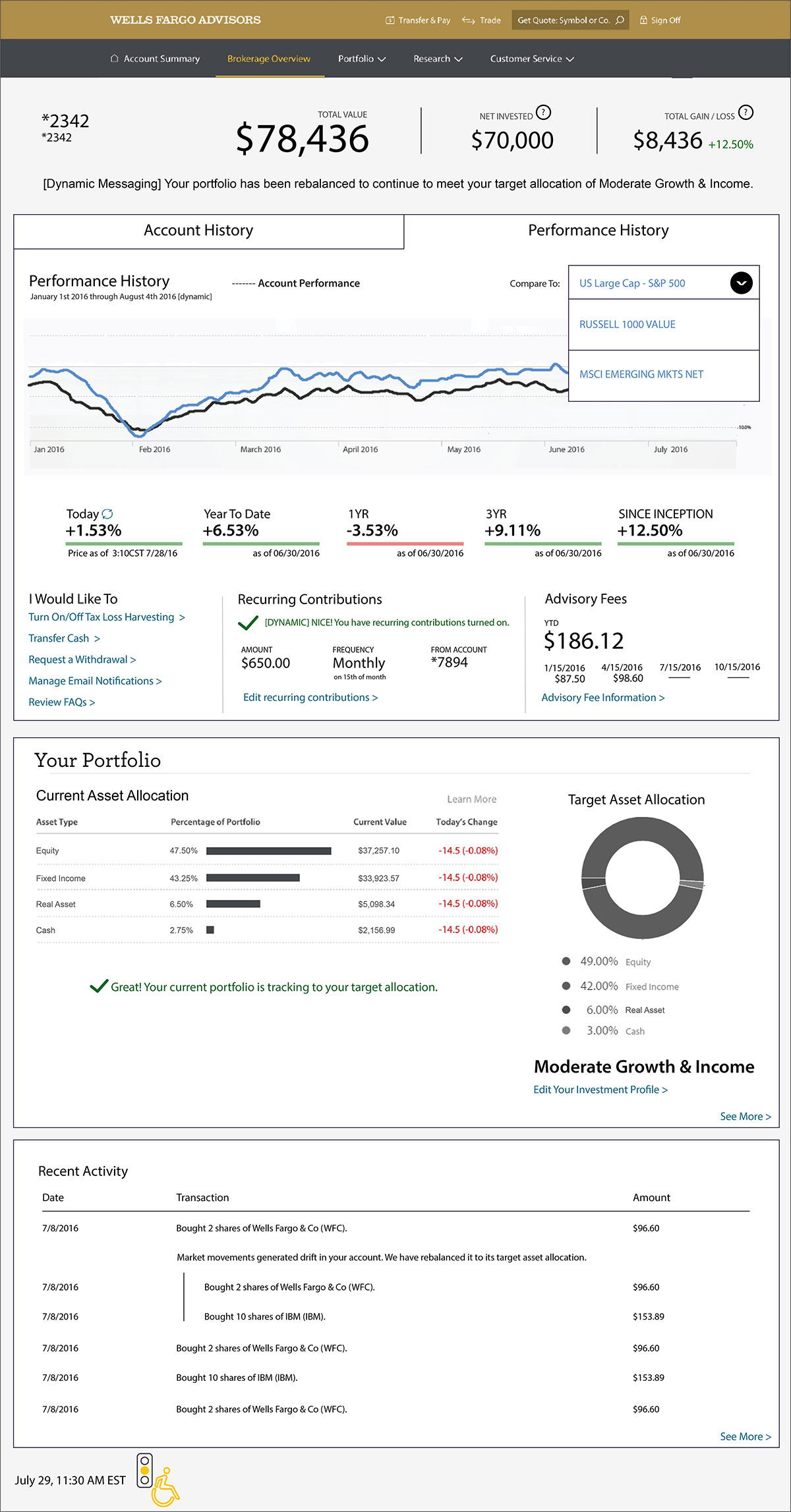
and iterated…
Are you still reading this? If you are, you probably need a break by now. I sure as hell did at this point. Go get some fresh air.
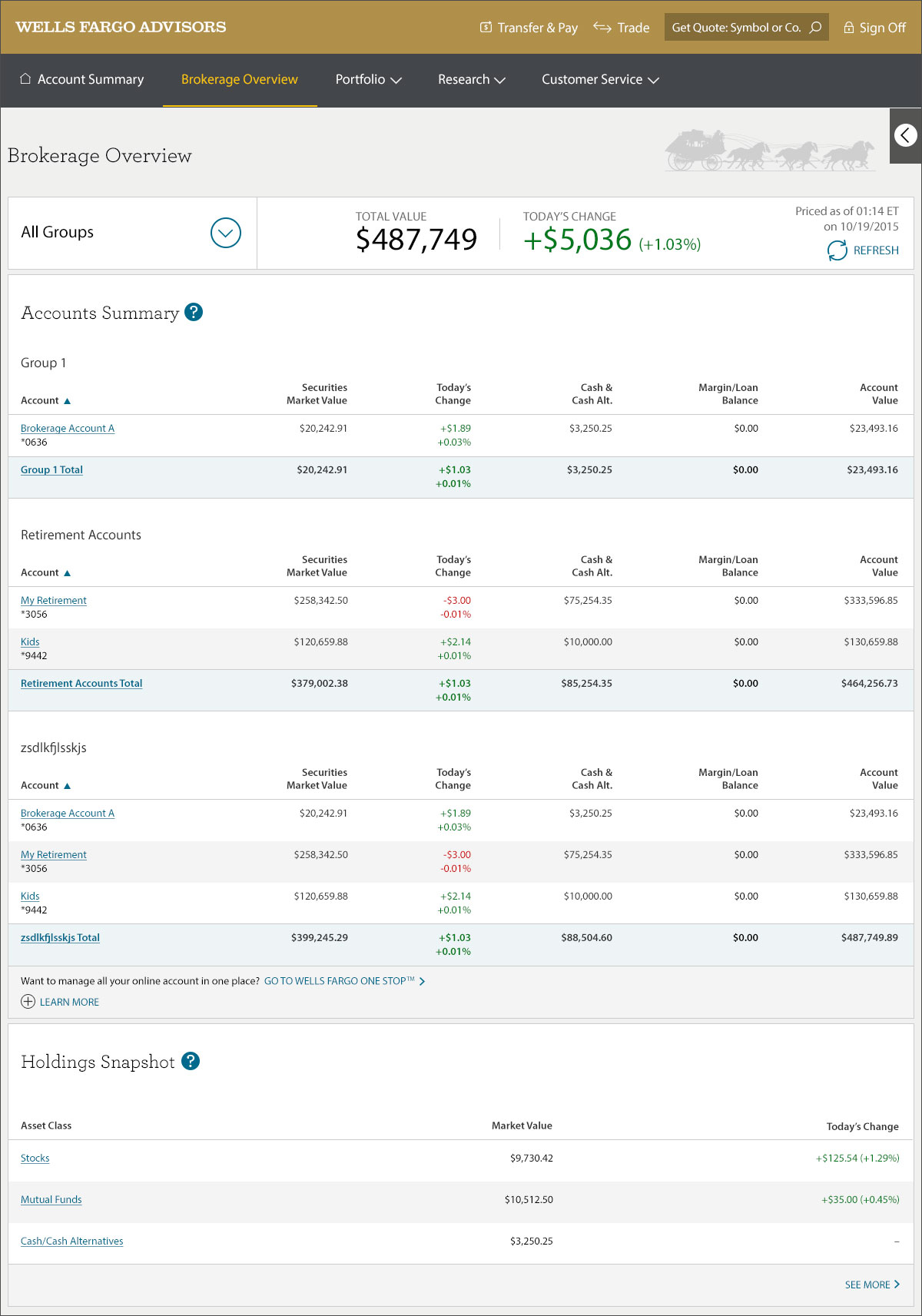
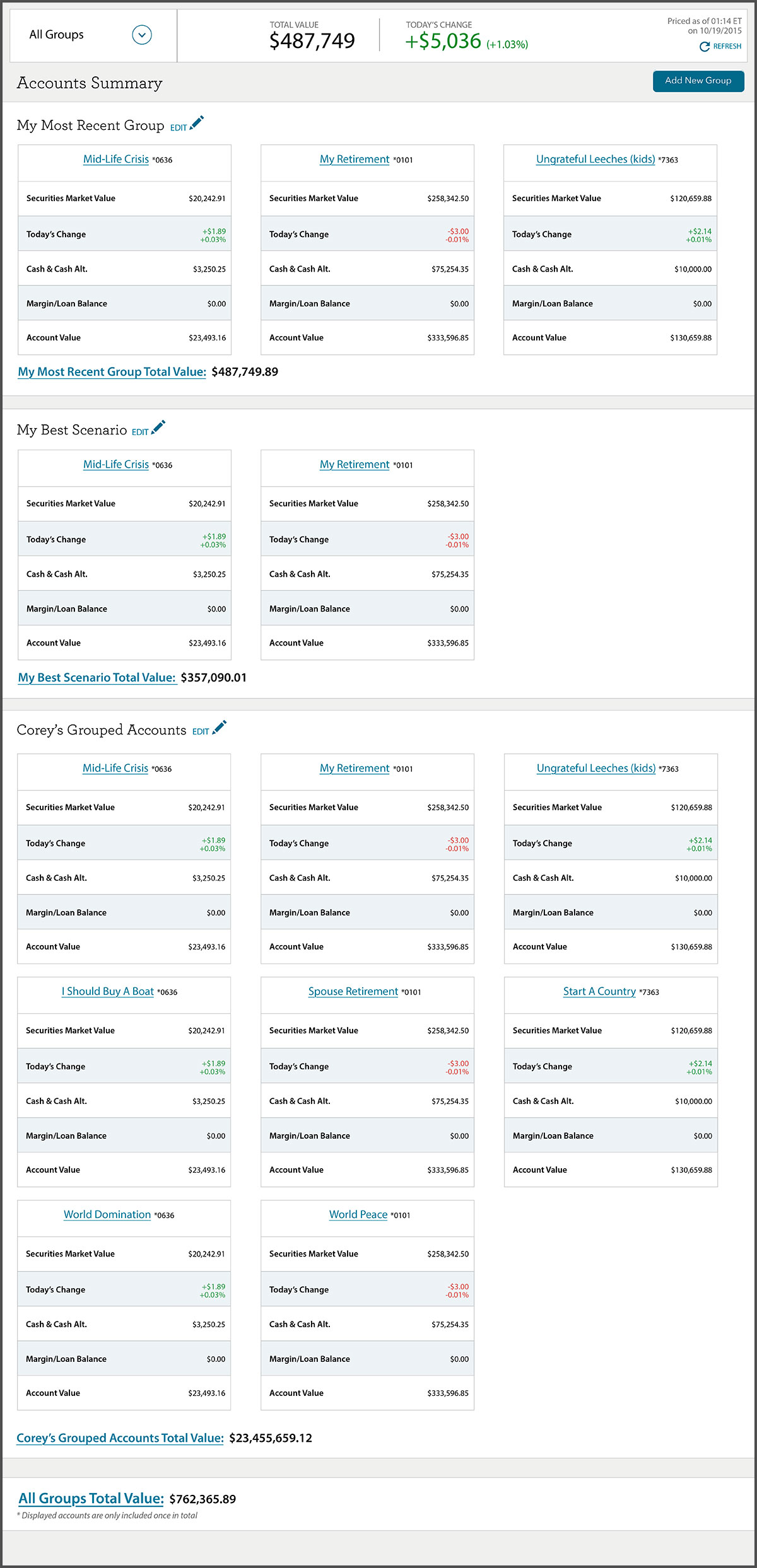
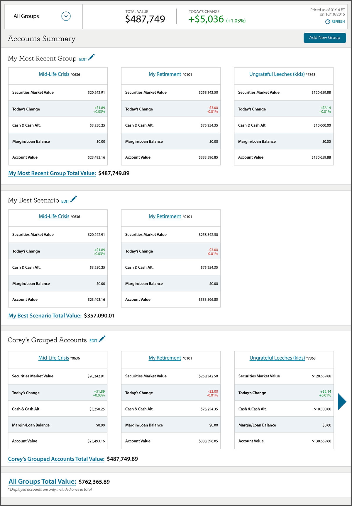
These are just a handful of concept versions of the dashboard that I made. The experience was tested and iterated to Bejeezus and back as it was important to get the customer’s nerve center to be in as best shape as possible.
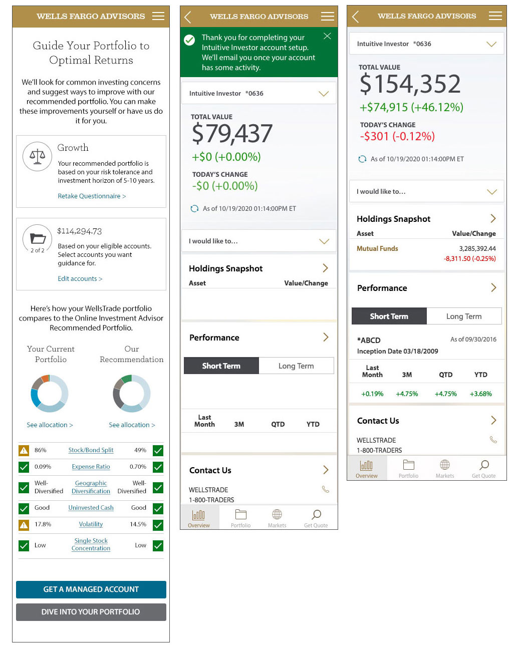
Mobile screens
Every screen needed a specifically designed mobile layout, and was not to be left to the Javascript framework to dictate without UX guidance. Our mobile user persona was different and several features were hidden after gaining insight from testing.
Guidance screens
This part of the experience precedes customer account creation. I worked on designs for these as well, and proposed using a myriad of graphs and charts for fast recognition of the details being explained. A user is less likely to spend time reading information that’s not relevant to them if they can see their details are in good shape already.