Intelichart PatientPortal App

The UX Challenge

I’m leading the user strategy and design for Intelichart and their patient portal app. The company’s existing web application is quite sophisticated, and my job is to break down the complexity to a simple, intuitive mobile app.

The UX Approach

Since the company is quite small, it was not possible to retrofit the entirety of the web application to a mobile app. I lobbied the executives and sales teams that this would have been a poor approach anyway. A mobile user is going to have different intentions and a different use case than someone using the web app.

I conducted a design exercise with senior management to uncover their perspectives and what they felt the goals of the application were. Everyone was asked to plot their ideas within a target range of importance and allow them to be discussed and agreed or dissented on.

So for the initial release, we settled on the highest priorities for a mobile user: sign up, messaging, appointments, lab results, and medications.

For each section, I needed to understand the underlying intent for each, then strip what would be noise for a mobile user. For example, a user would have interest on the results of their latest labwork (mobile), but not likely their entire medical chart (web app).

Also as part of the ongoing design and development, I established a cadence for milestones and communication with product owners and BAs. I also established the asset delivery pipeline with the technology team using Sketch and Invision. Engineers are empowered to pull resources they need and ask questions directly from the design hub.

The Final Product

The app was released in May 2018 for Android and is pending review for iOS. Pre-release feedback from the client services team has been very positive.

The UX Impact

This tool is hotly sought after by Intelichart’s clients and will level their competitive playing field.

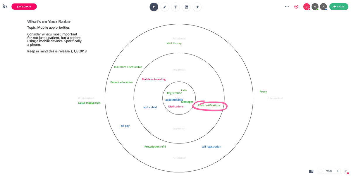
What’s on Your Radar

This was an exercise I hosted very early on. The process was to get management to decide on the most important features for the first release of the mobile app. Obviously everything had some merit, so the point was to make sure we were all in agreement on the priorities and work on those first.

This exercise was done remotely using Invision’s Freehand tool.

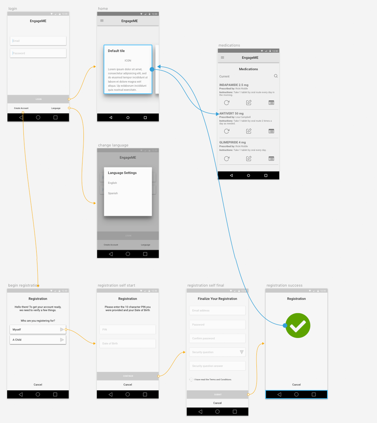
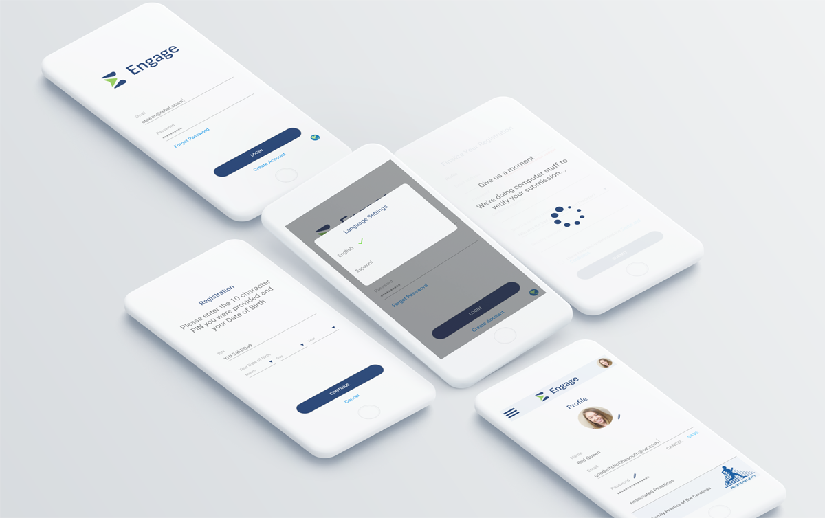
User Flow Diagram / Wireframe Prototype

Small sample of the first few steps of the user’s experience journey. Made sense to keep this well organized and labeled and simply use this as the early interactive prototype to share with Engineering.

Saved time and I was able to administer death to two feathered avian creatures with a single, solid mass of earthen material.
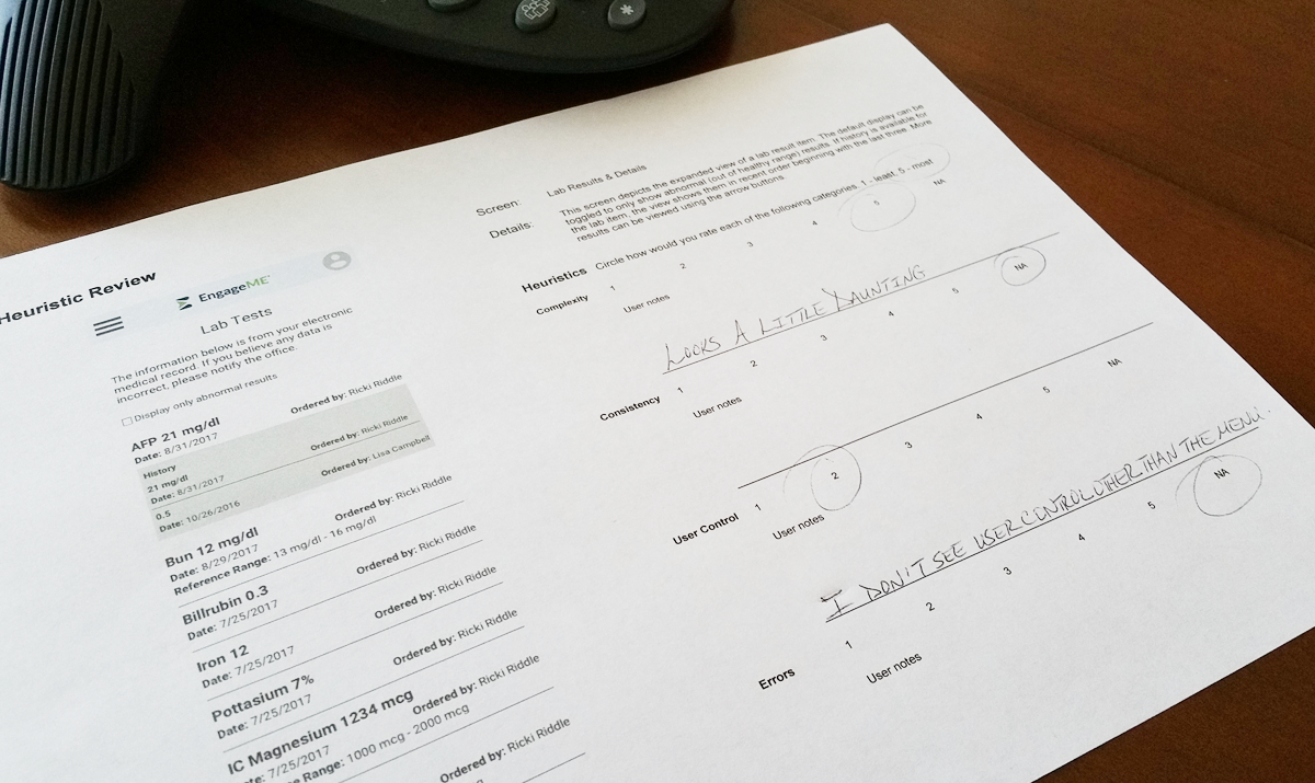
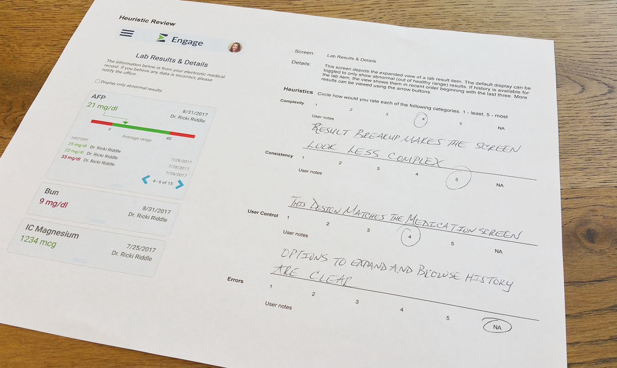
Heuristics Analysis

Following major design updates, in this case after the prototype and visual design phases, screens are put through a basic heuristic analysis. This is to make sure common usability points are not overlooked.

This was the one sample done and returned in person. All other participants (team members not on the project) submitted remotely.

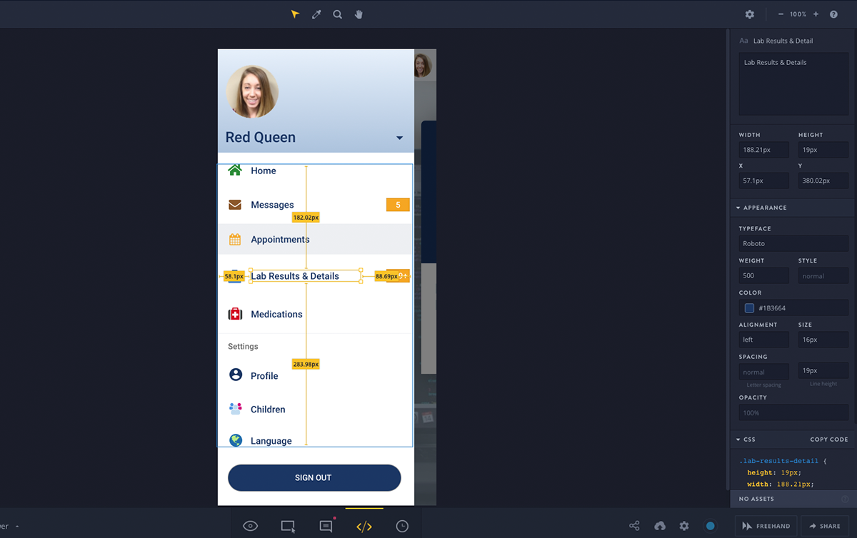
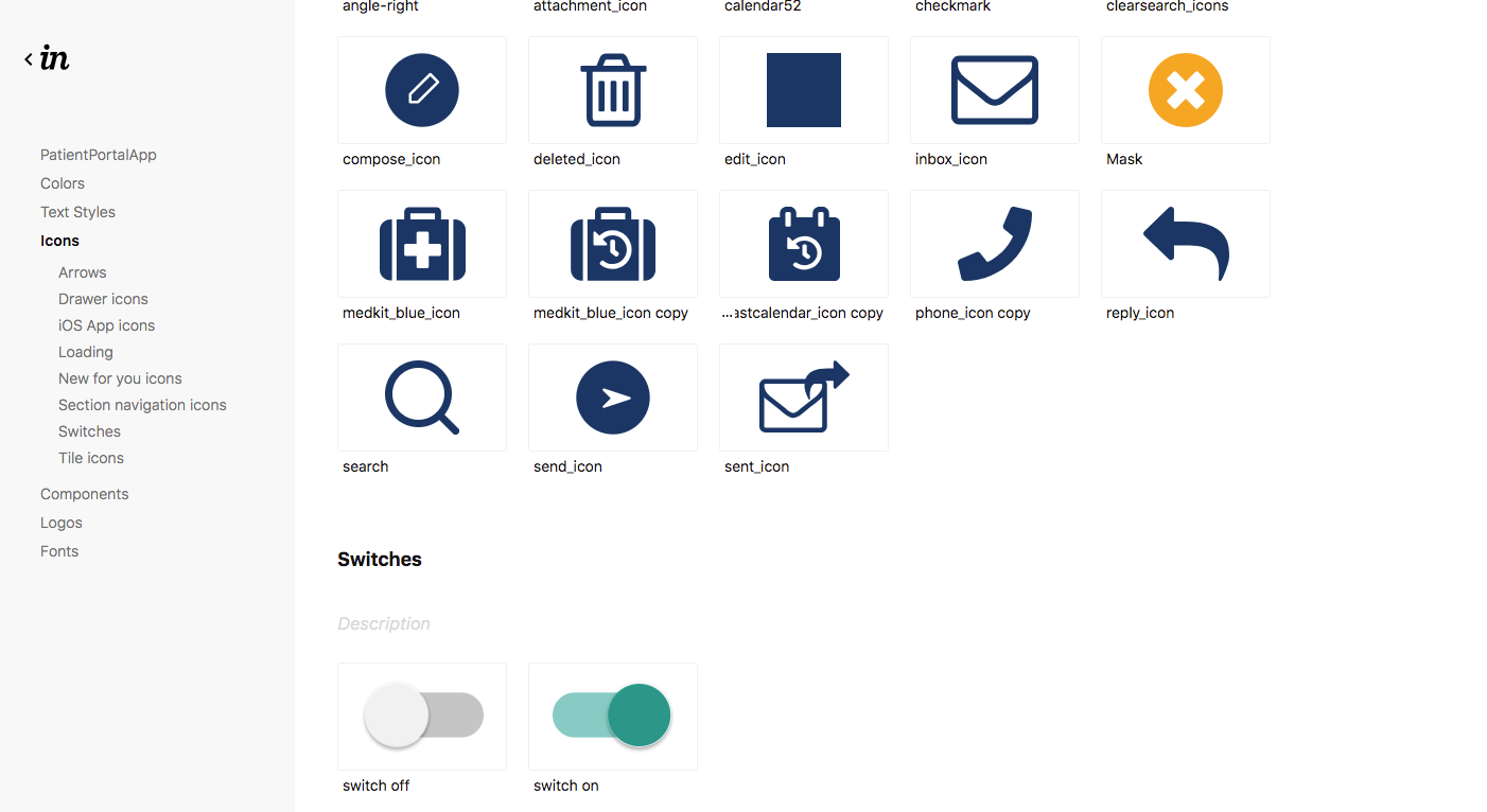
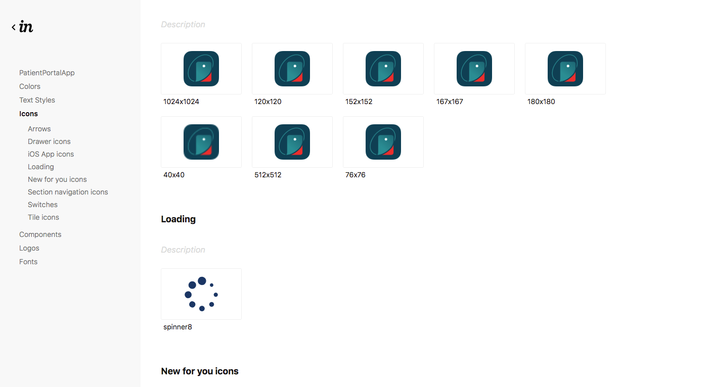
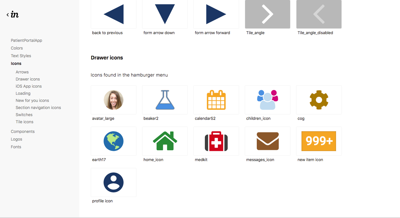
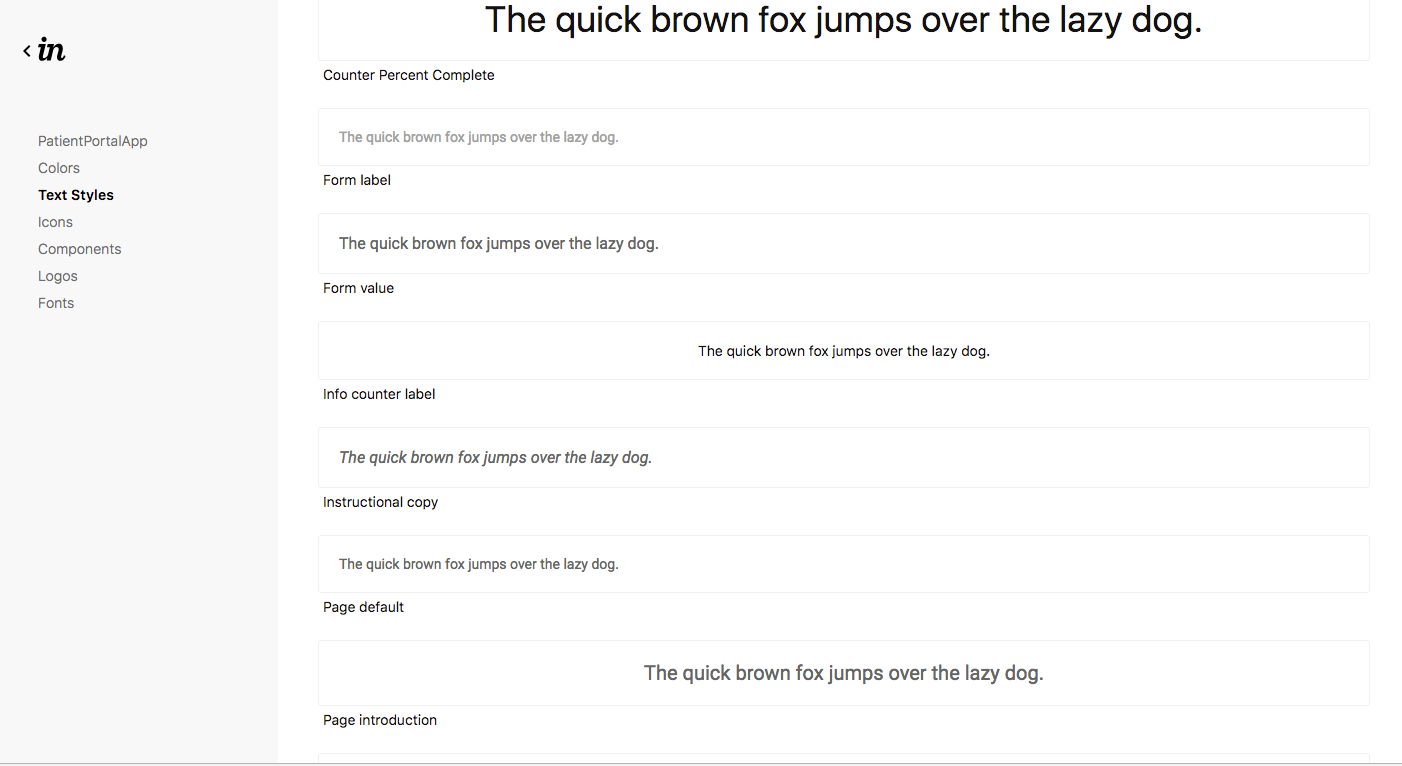
Asset Library / Design System

I introduced this pipeline to a very ecstatic engineering team. 

Isn’t it great when modern tools handle work for you? Invision’s Inspect mode eliminates the need for me to create “spec documents” that become outdated the minute after they’re exported. Every change I make is instantly reflected in the design system and devs can interact with screens and message me directly with questions. Devs can also grab whatever graphic assets they need from one place, and in context.

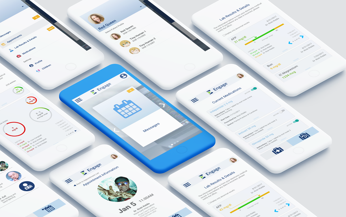
A collection of some of the in-flight visual designs.

Yes, final polish is my responsibility on this one too 🙂 

© 2024 Corey Nelson AI Trainer and Chatbot Conversation Designer