Corey Nelson AI Trainer and Chatbot Conversation Designer
Specialist AI Conversation Designer and Consultant
Corey Nelson AI Trainer and Chatbot Conversation DesignerUS Government Artificial Intelligence Use Case Library
The UX Challenge
In an effort to strengthen the position of the country and upskilling the workforce of the United States in the field of Artificial Intelligence, the White House issued an Executive Order that the General Services Administration (GSA) picked up as part of its Technology Transformation Services (TTS). I was hand selected to lead a team of researchers, designers, and developers to create a curated repository to store, share, and promote the use of AI in government.
The UX Approach
Working closely with the Head of Artificial Intelligence Portfolio and his team, we conducted a battery of interviews and prototype testing to build an MVP over the course of about 6 months. We were beholden to a few constraints, namely a finite budget, use the US Web Design System and the extremely convoluted complicated Authority to Operate (ATO) process. Ultimately, we allowed the community of AI practitioners and educators to take a strong part in building this application as nothing like it existed.
The Final Product
The project started as an extension of GSA’s existing digital.gov. It soon gained enough interest and support to become its own entity as a flexible, product agnostic information sharing platform.
The UX Impact
This application had a lot of eyes on it, from our internal management up to high ranking levels of government. Interest was not only from the code we planned to deliver, but also to what ended up being our delivery model overall. We ended up with a fairly extensive backlog of features that could not make the MVP, along with definite plans to replicate the implementation to replace older existing platforms.
*As of the time of writing this case study, this project is still in the final stages of approval and had not been deployed to its URL.
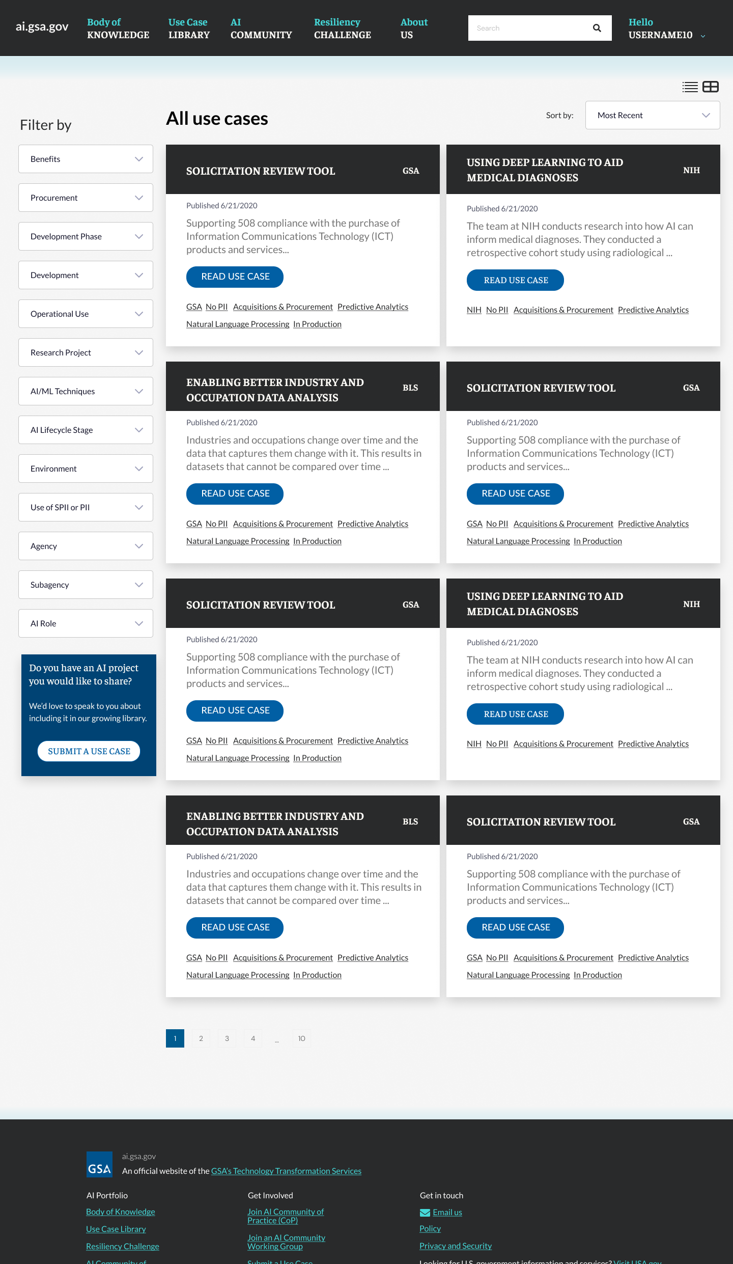
A view of the library result set from our prototype. The filter options are many, but actually less than what we thought we’d end up with from user testing. Deciding on a single set of high-level options to filter by was one of the biggest challenges. We’ll launch with this and monitor usage, then refine what seems to be less useful.
*As of the time of writing this case study, this project is still in the final stages of approval and had not been deployed to its URL.


Initially, this platform was going to be integrated into digital.gov. However, a few things caused a pivot.
- We interviewed quite a few high-ranking military officials. As such, many of the use cases to be shared had security considerations and had to be placed behind a login. Digital.gov is completely public, and we could not negotiate changing this (we tried).
- We immediately saw an opportunity to abstract the platform from its content, based on research done for other projects and deliver a reusable set of code that could be implemented anywhere.
- Post MVP research and planning pointed to the inclusion of a Learning Management System to truly take on the role of upskilling the workforce. This would not integrate well into digital.gov given the levels of navigation and search we would need.
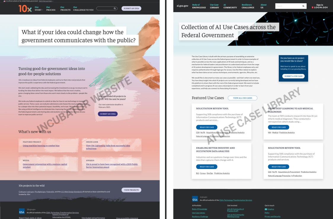
Another HUGE WIN from this project was when I found that another one of our project teams was redesigning the incubator website. All government sites are mandated to use the US Web Design System, as we were also doing with the AI project. However, once we were cut loose from integrating with digital.gov, we were free to go in any thematic direction we wanted.
The sister team had spent months researching and AB testing a design direction that was uniquely creative, but wasn’t locked into a “government website” look and feel. That team truly pushed the creative extensibility of the design system like never before.
I decided to leverage the work already done for that project and use it as a base theme for mine. This saved hundreds of hours of additional testing and design exploration. We also saved on development as the code was mostly transferable along with the excellent guidance from the original devs. Collaboration in overdrive on this one.
*As of the time of writing this case study, this project is still in the final stages of approval and had not been deployed to its URL.
This looks great! Can we use it for another project?
This was said twice over the course of the project’s development. Once by me, as mentioned above about using the existing framework from another unrelated website.
And second, by TTS Senior Management when we first demoed the initial prototype. Even over the Zoom call, the gears turning in his head could clearly be seen moving furiously. As we pitched for additional funding, he had ZERO questions about the contextual use of AI that we were building the platform for. Instead, he had dozens of questions and comments about the utility of the platform itself and how we could reuse and scale it for other content. He envisioned this as being the flagship product among a suite of offerings currently being developed under the 10x umbrella.
")
")
")
")
")
")
")
")
")
")
")
")
")

As part of the funding process, my team and I collectively put together a brief, high-impact pitch deck. Even though we were asking for $125,000 in funding for our next phase, we kept the pitch length to less than 15 slides to quickly get to the point.
*As of the time of writing this case study, this project is still in the final stages of approval and had not been deployed to its URL.